Design Guidelines
ContactIntroduction
The Wellness is private medicine built around one person at a time. Every marker is read with a doctor, and the brand should feel the same. It is calm, precise, personal and whole.
"The Wellness" name, the wordmark, the lotus and our other marks belong to The Wellness. These guidelines help partners, hotels, clinicians, press and our own teams use them well. When something here doesn't answer your question, ask us before you publish.
Logo
Wordmark
The wordmark is the most direct expression of the brand. It is set in Libre Baskerville Regular with tracking at minus 8%, so the letters sit close and read as one quiet line. The tight space between "The" and "Wellness" is part of the drawing.
It scales freely, but its proportions are fixed. On film and on cards it sits alone, centred in the frame, black on white or white on a field or image.
- Typeface
- Libre Baskerville Regular
- Tracking
- −8% (−80 units)
- Clear space
- One point, the cap height, on every side
- Minimum size
- 96 px or 22 mm wide
Dos and Don'ts: Wordmark
Don't stretch or alter the wordmark in any way.
Don't recolour it. Black, or white on a field or image.
Don't crop the wordmark.
Don't add shadows, glows, textures or effects.
Don't retype it or change its spacing.
Don't place it over a busy image. Choose quiet frames.
The point
Everything starts from one point, the dot that waits after a question the way a doctor waits for an answer.
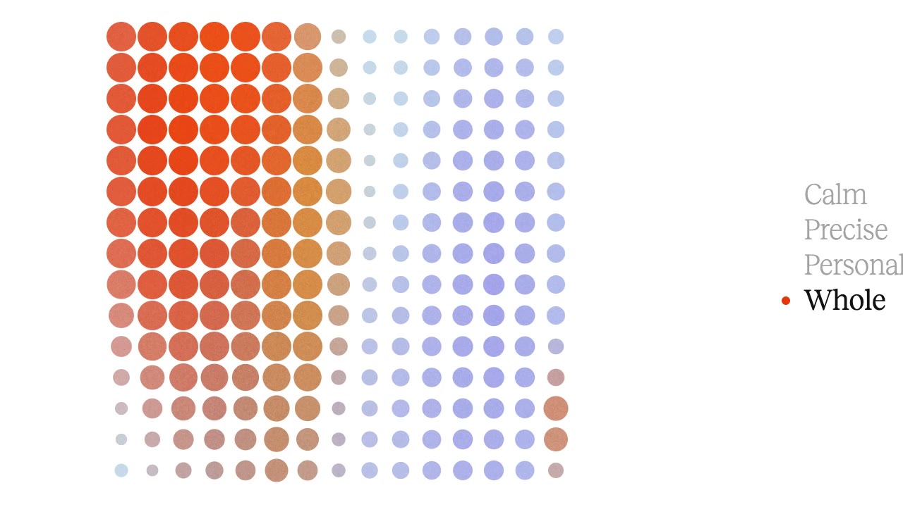
The point breathes, grows and gathers. It opens into round windows of footage, measures clear space around the wordmark, and sets the rhythm of every grid. Gathered into fields, points become halftones of the poster colours. Use it in ink on white, white on a field, or vermilion when one thing needs to be singled out.

Lotus
The lotus is drawn from photographs of a real sacred lotus, Nelumbo nucifera, seen side on and fully open. It grows from still water and opens wide. That is the brand's idea of health.
It is drawn the way an architect sketches a building. Guide lines come first, then fourteen slender petals fanning from the upright cup at 90° to the outer petals lying almost flat at 7°. The bloom is 2.7 times as wide as it is tall. The finished mark keeps one fine line weight, so it sits as quietly as the wordmark.

The architect's sketch, with its guide lines and construction arcs, and the finished mark in white on a field.
The lotus is a supporting mark. It signs off films, marks app icons and favicons, and appears on objects where the wordmark won't fit. Never use the lotus and the wordmark side by side as a lockup.
Dos and Don'ts: Lotus
Don't fill the petals or mix colours.
Don't stretch it or thicken the line.
Don't use the lotus over a busy image.
Do give it at least its own height of space on every side.
Do set it in white on a poster field, or in ink on white.
Do use it with lots of open space.
Gallery








Imagery
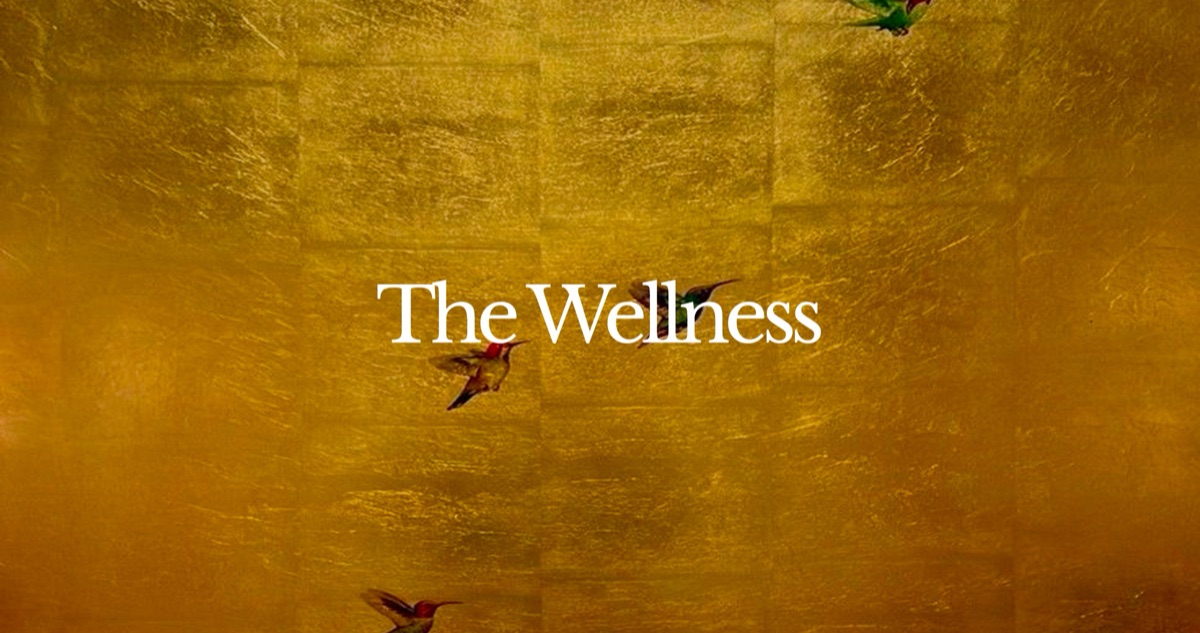
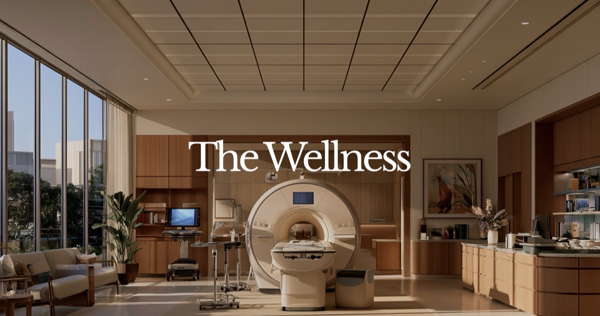
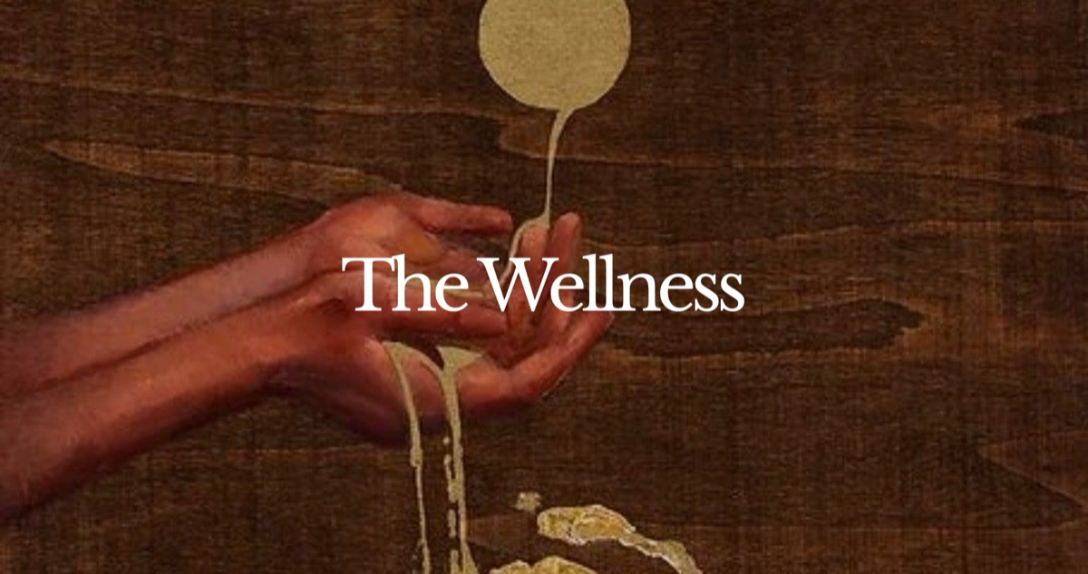
Natural light, real texture, and space to breathe. Images should look found rather than staged, like water, stone, skin, gold leaf or a quiet room. The wordmark sits centred on the calmest part of the frame.
One subject, one light source, lots of air. No skylines, neon, timelapses or drone tourism.
Real people, real rooms, real materials. No stock smiles, no glowing anatomy.
Muted, warm grades with natural skin. Desaturate slightly rather than push colour.
Brand partnerships
When the wordmark sits beside a partner, give each the same optical height, divide them with a single hairline and keep the clear space of both. Neither leads; neither is recoloured. On posters and film the partner is named in Inter Tight on a field, with the place's coordinates in the corner.
140.1° E
A partner hospital takes the lockup on its own field, wherever it is. Cities by The Wellness uses the same lockup with the city's name.
Dos and Don'ts: Brand partnerships
Don't add colour to the partnership lockup.
Don't set the two names at very different sizes.
Do match heights and keep the white hairline.
All co-branded material is approved by both brands before it is published.
Posters
Posters set the whole system on one page. A field with rounded corners holds the lockup, centred, with the place's coordinates or its name in the partner's script in the corner. Below it, a plain Inter Tight headline and a two-line note, and the contact details at the foot.
LinkedIn documents
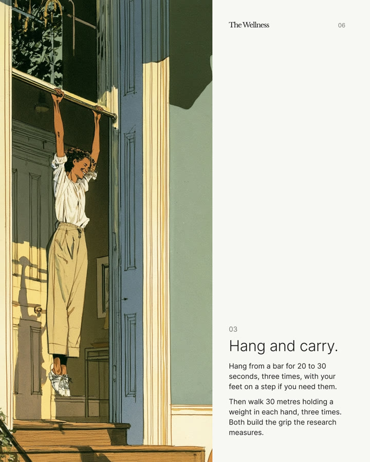
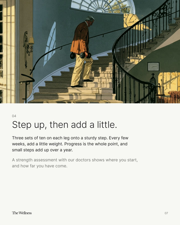
Health notes are single pages at 4:5 on paper. The wordmark sits top left with the note's topic beside it. A two-line headline in Inter Tight, the first line medium and the second light, then one photograph or one field, and a short paragraph that names its source.
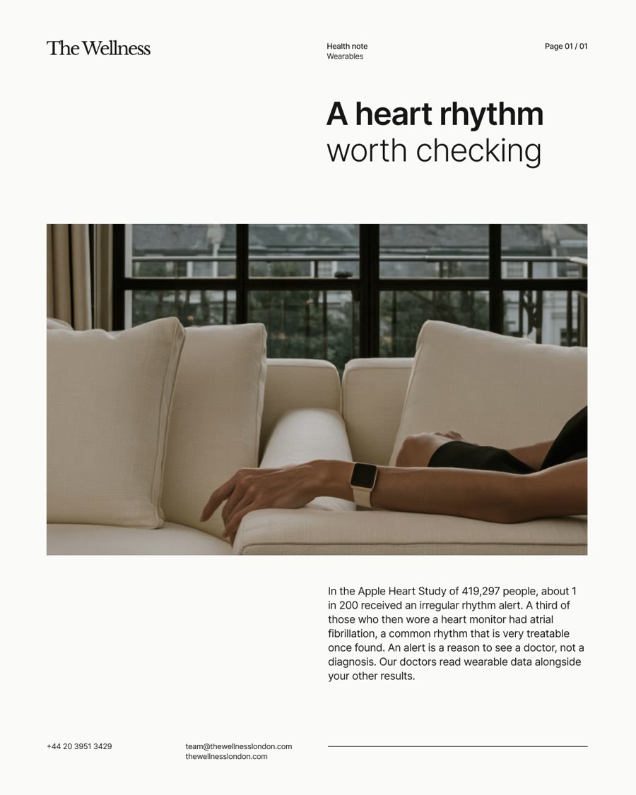
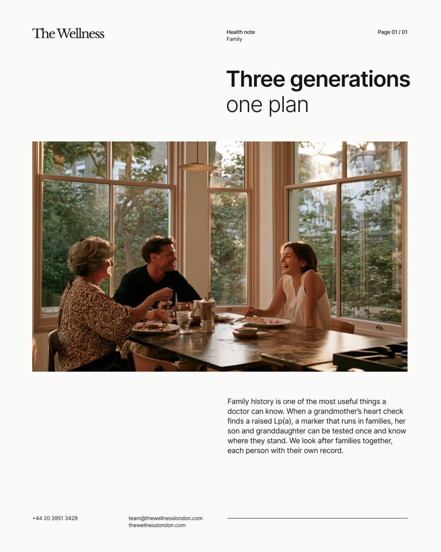
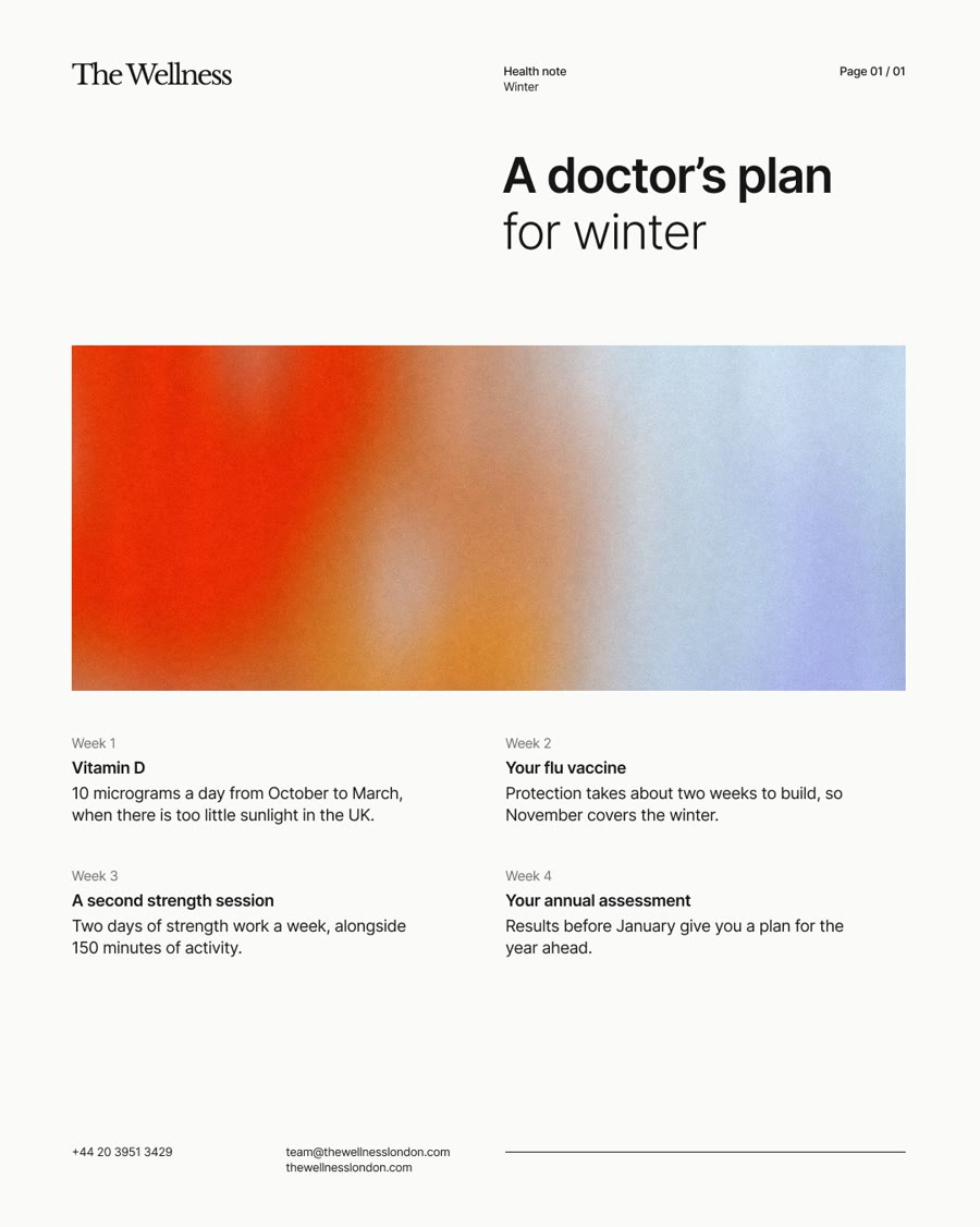
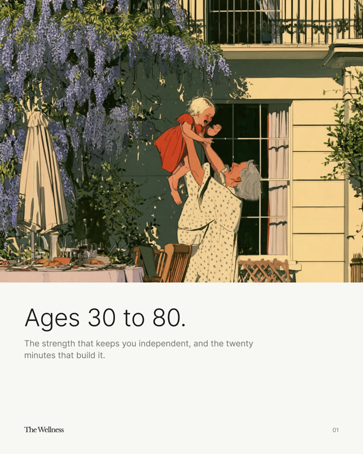
Carousels keep the same paper and type, and let illustration take whole pages. A cover, the evidence, then one idea per page.
Illustration
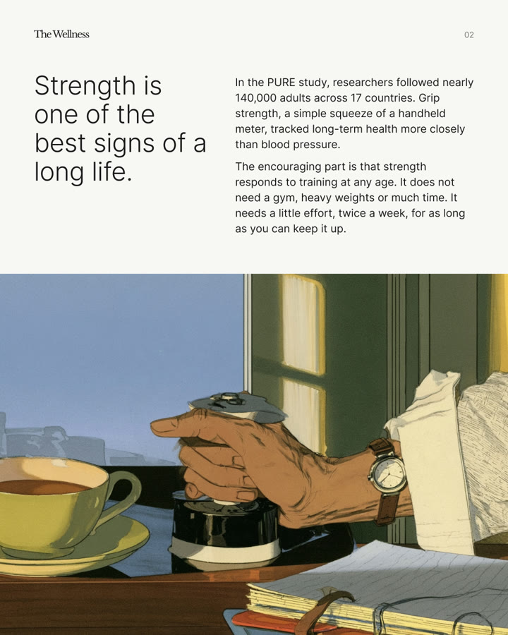
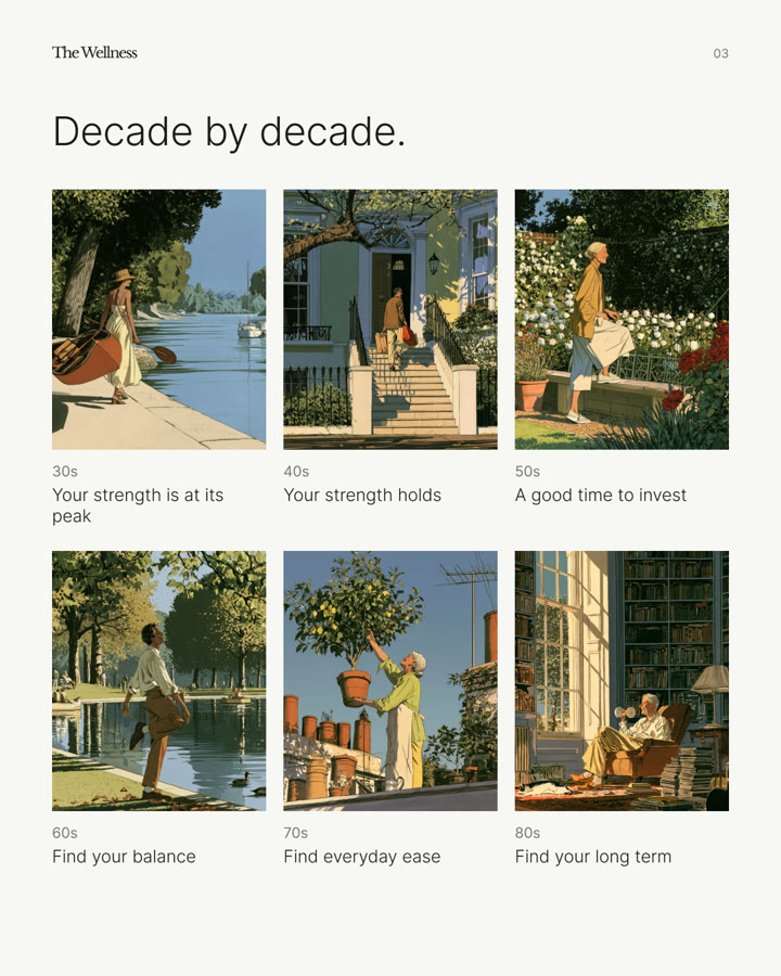
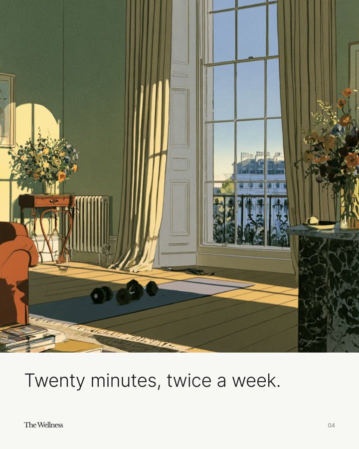
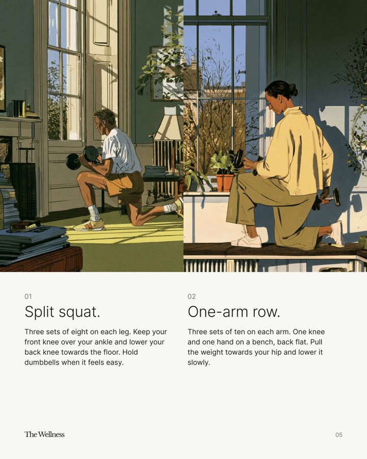
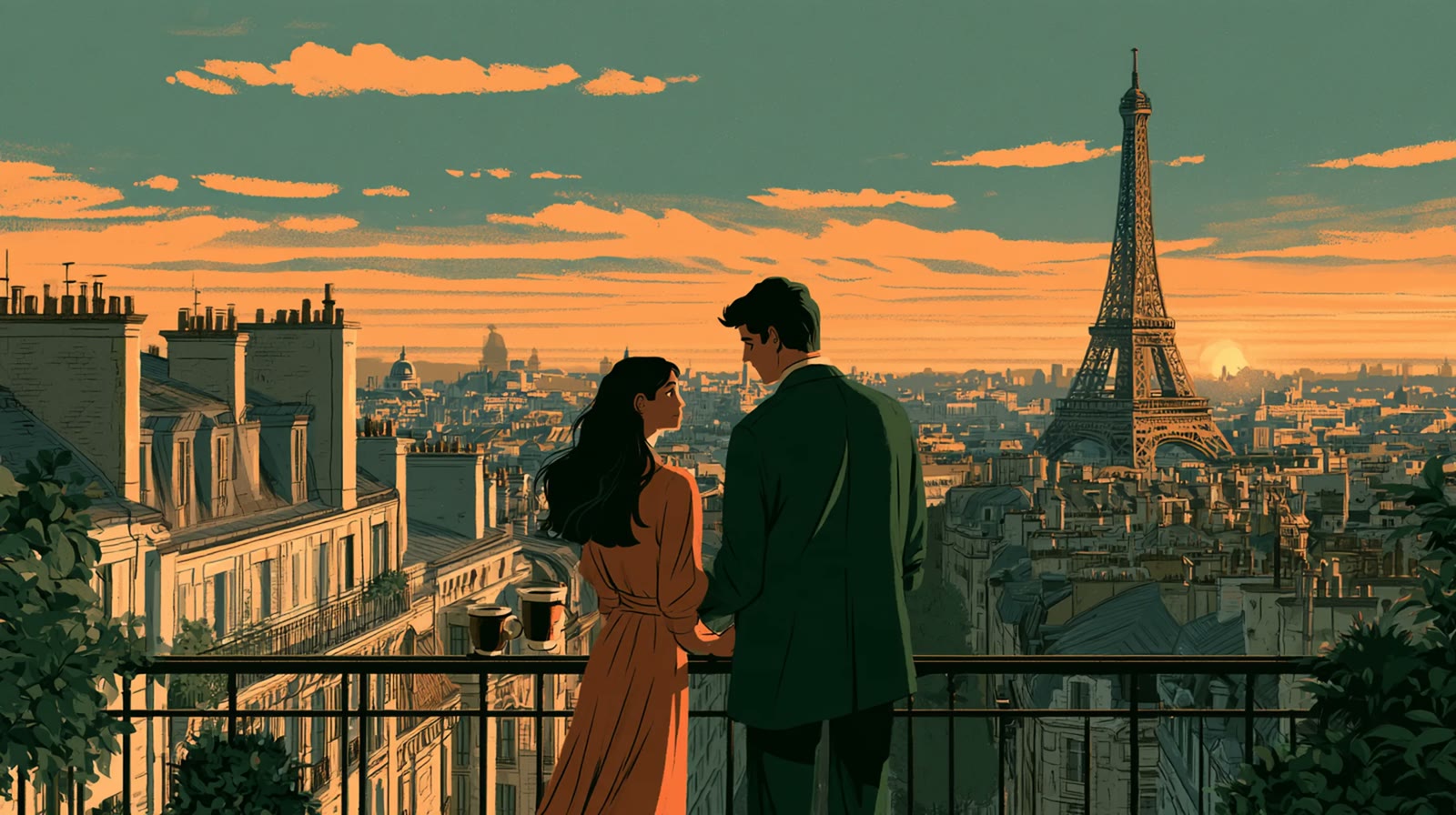
Cities by The Wellness is illustrated. Warm, painterly scenes of people arriving in each city, in morning light or at dusk, with the city's real landmarks and no text inside the picture.







Typography
Three families, each with one job. Light weights do most of the work; emphasis comes from size and space, never from capitals.
We work in London and Dubai, so Latin and Arabic come first. Use the system's matching script face for anything outside Latin, at the same optical size.
Colour
The palette is mostly white, with ink and five colours sampled from our posters, which are vermilion, amber, clay, periwinkle and sky. They are rarely flat. They meet as a soft field, blurred together with a fine grain, the way light falls through glass. Each field sits in a rounded frame on white. Select a swatch to copy its hex value.
Fields lead with one warm colour and one cool. Keep a clear area of sky where the wordmark or lockup sits, centred and in white.
Language
We write the way a good doctor talks, plainly, warmly and with evidence. Lead with what the person gains, name the thing we do, and never overclaim.
Dos and Don'ts: Language
Say+
Wherever you are, someone is expecting you.
A doctor who knows your history.
Your plan, written for you.
Don't say+
Unlock your ultimate biohacking potential!
Detect disease before it's too late
THE WELLNESS: YOUR HEALTH, REVOLUTIONISED
Our name+
Write The Wellness in full, with a capital T. Never TW, never "Wellness" alone.
Emphasis+
No capitals for emphasis, no exclamation marks, no em dashes.
Claims+
Every claim has a source. Ranges are ranges, not verdicts.
Film+
Every film carries captions.
Contact
For permission requests, partner lockups and press, contact The Wellness brand team at team@thewellnesslondon.com.
Press
When describing the company in press materials, please use:
The Wellness is private medicine led by doctors, built on evidence, and with you wherever you are in the world. Every result is read with a doctor, and every plan is built around one person at a time.
Usage terms
"Marks" means our names, the wordmark, the lotus, and any design element that identifies The Wellness. By using them you agree that:
- You use the Marks only as these guidelines describe, and only where they relate to The Wellness.
- Permission is non-exclusive and non-transferable, and we can review or withdraw it at any time.
- You don't feature our Marks more prominently than your own, or imply an endorsement we haven't given.
- You update your materials within a reasonable time when these guidelines change.